
Design a navigation system that inspires exploration
I led the redesign of the app’s navigation system for 300+ tours, that feels dynamic and encourages exploration.
PROJECT CONTEXT
Bitgym is a small but innovative company focusing on making digital products that help people exercise with the most beautiful and immersive tours filmed all over the world, from the convenience of their cardio machines. At the time, the product had gone through a few rounds of evolutions. However, the hamburger menu didn’t feel inviting to the users, and was definitely underselling its content.
OUTCOMES
Bitgym is a small but innovative company focusing on making digital products that help people exercise with the most beautiful and immersive tours filmed all over the world, from the convenience of their cardio machines. At the time, the product had gone through a few rounds of evolutions.
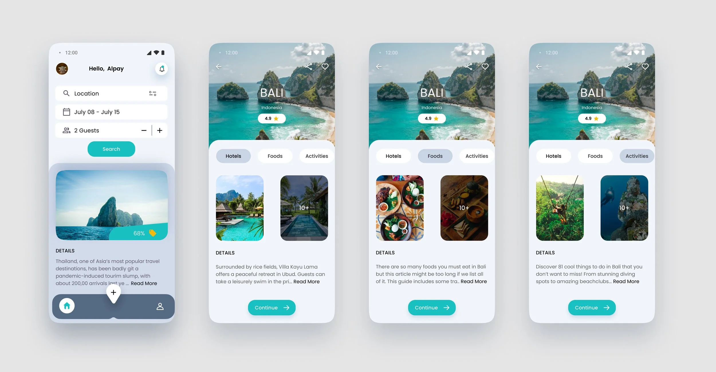
DESIGN GALLERY
Ways of Navigation
Users can explore in three intuitive ways:
Spin the globe to discover locations visually.
Browse the tour list for a more structured overview.
Search with keywords to find specific places or topics.
These options are designed to match different user mindsets—whether someone is looking for a known destination or just casually exploring.
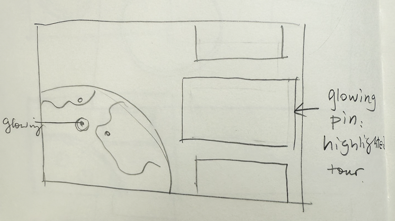
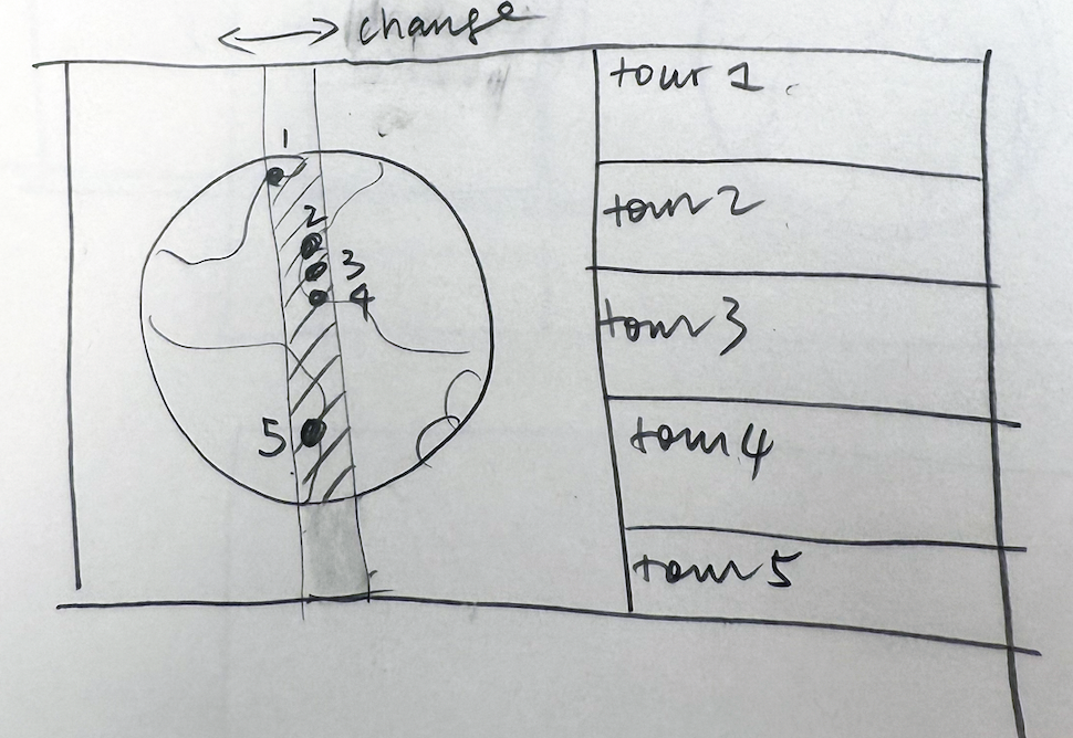
Explore the world through the globe
We chose a 3D globe as the primary navigation for all tours to evoke a sense of exploration and adventure. Its interactive design makes discovering new destinations more engaging and fun. Prefer a simpler layout? You can easily switch to list view anytime.
Tour details
The tour details page creates excitement with the open scenic image. The checkmarks help set expectations of what’s coming in the tours.
OUR CHALLENGES
Lack of clear brand strategy
In the past, the app has been evolving organically without an overall brand strategy. It’s unclear what their target audience is, and whether it wants to be a goal oriented fitness app or a leisure app about exploring and experiences different places.
Complexity in taxonomy
BitGym originally focused solely on motion-tracking technology, sourcing all their tour video content from third-party vendors. But as the company evolved, they began producing their own in-house videos. Now, with a growing and mixed library of content—the challenge is to unify everything under a single, consistent taxonomy that makes content easy to organize, search, and enjoy.
Limited resources
Bitgym, unlike many other start-up companies, decided not to take big investment. They want to be nimble and agile about how they allocated their resources.
DESIGN APPROACH
The engineer and I quickly decided that we wanted to work very closely to design, test, and iterate the prototype very quickly.
The concept of Globe has been in everyone’s mind for a while— it’s a natural way to organize all the tours, and it’s very intuitive when it comes to the idea of exploration.
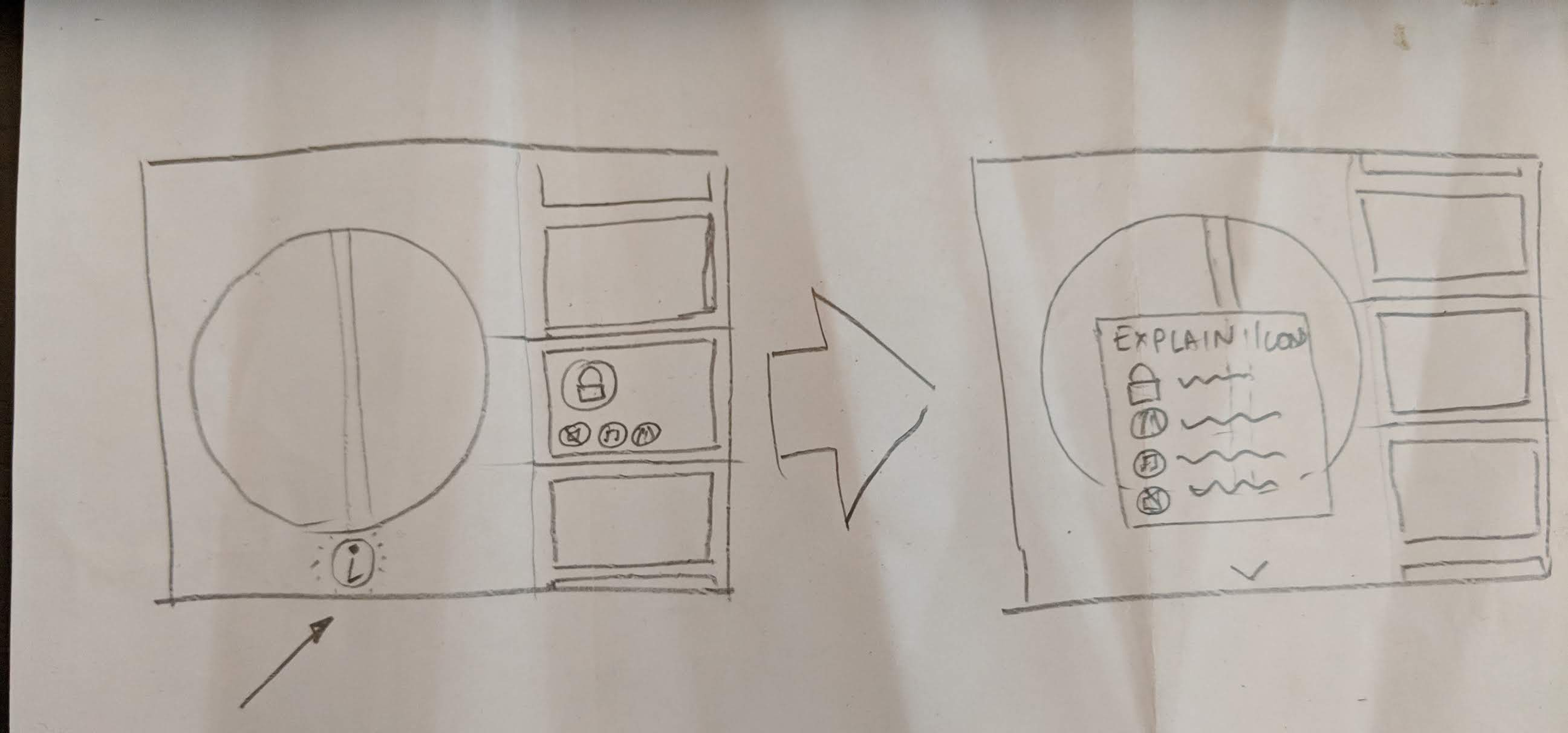
We sketched out general ideas of how the Globe interaction could work.


Sliding menu and taxonomy on how to include all tour library

The Engineer and I went to numerous rounds to prototyping and eventually landed on this navigation.
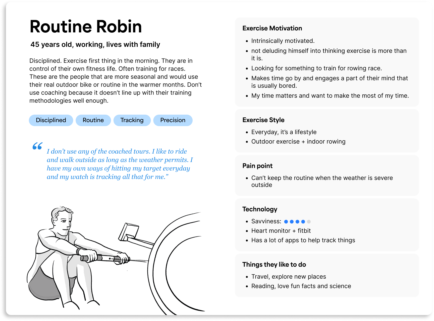
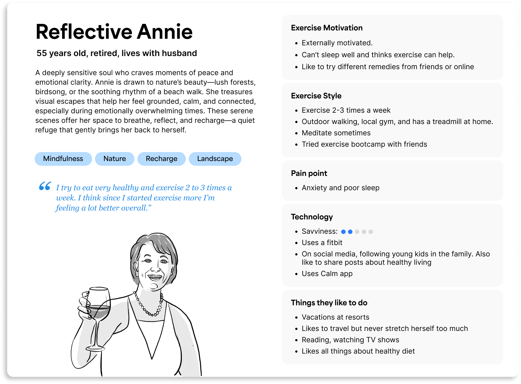
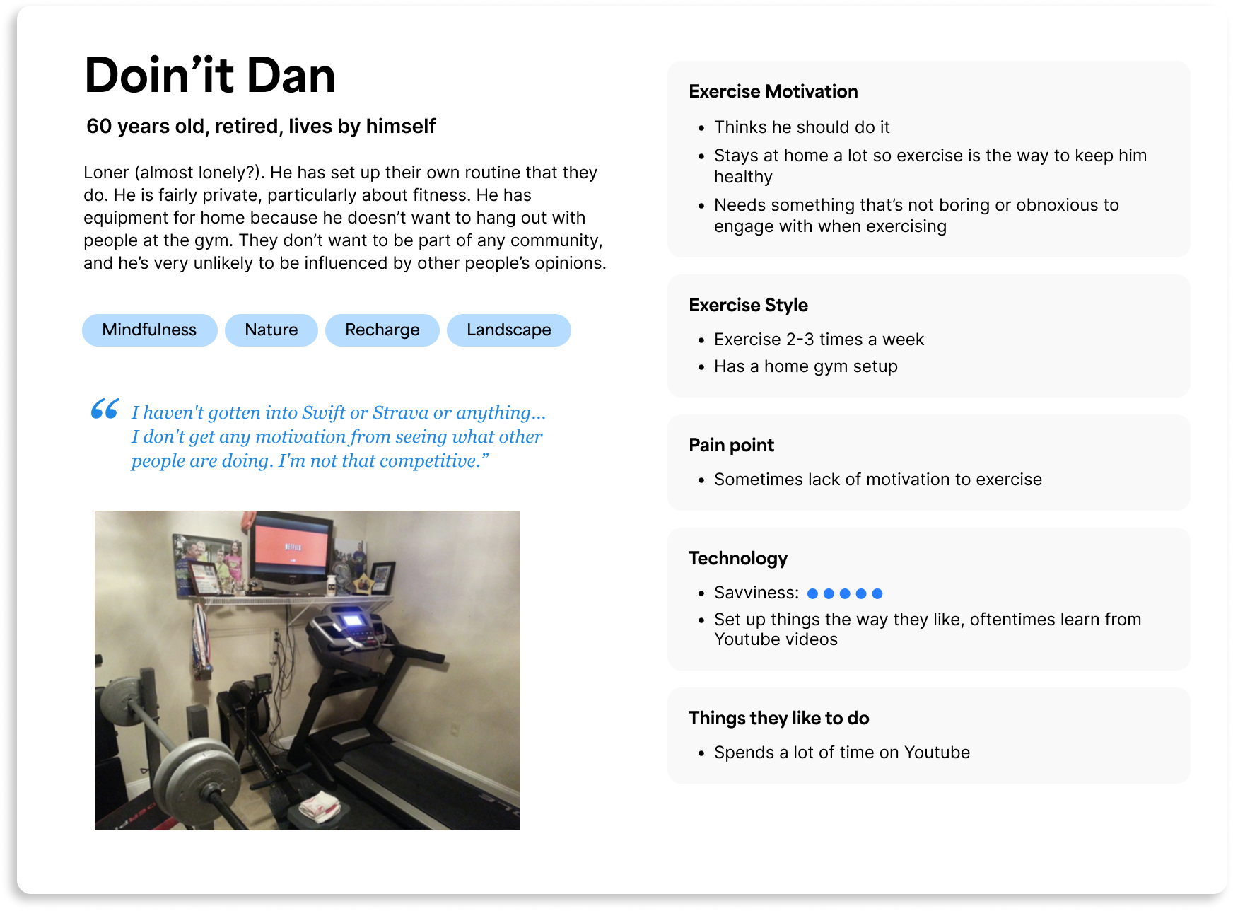
UNDERSTAND THE USERS
We sent out surveys to 1000 current Bitgym users and picked 22 of them for in-depth interviews. We also leveraged online research tools to talk to folks use exercise equipments at home to get a better idea of the total home fitness market. We then created research learnings and 4 key personas.
I drafted the in-depth interview guide and everyone on the team get to talk to 5 users. we got to speak and get to know about 30 current users and target users.
BRAND MISSION
Bitgym’s brand mission is to transform cardio exercise into an immersive and engaging experience with the interactive virtual tours, making workouts more enjoyable and motivating for users worldwide.
It’s about a better YOU
For Robin, Annie, and Dan, they exercise with Bitgym to relax and indulge in the beautiful scenes, not to compete with the others. It’s more important for them to be their better self than to be ranked amongst the others. Using data visualization and badge earning can help boost motivation.

It’s where exploration meets mindfulness
Explore the world from your home, revisit where you’ve been and where you want to visit. We want to tap in emotions and aspiration by using inspiring language and visuals.
Simplicity over feature richness
The current setup requires users to go through several steps—selecting a tour type, choosing their exercise machine, setting up camera tracking—which can make their first experience with the app feel overwhelming. We aim to streamline this process to ensure users can enjoy at least one smooth, delightful tour right from the start.
Speed interactivity is good, but not a must
The app has been putting a lot of emphasis on its speed interactivity feature. However, we find out many of the users actually play the tours with a fixed speed, but it does make them frustrated when not working properly.
Now we can design with Robin, Annie, and Dan in our mind. These 4 key design principles puts guardrails around our product development.
DESIGN PRINCIPLES
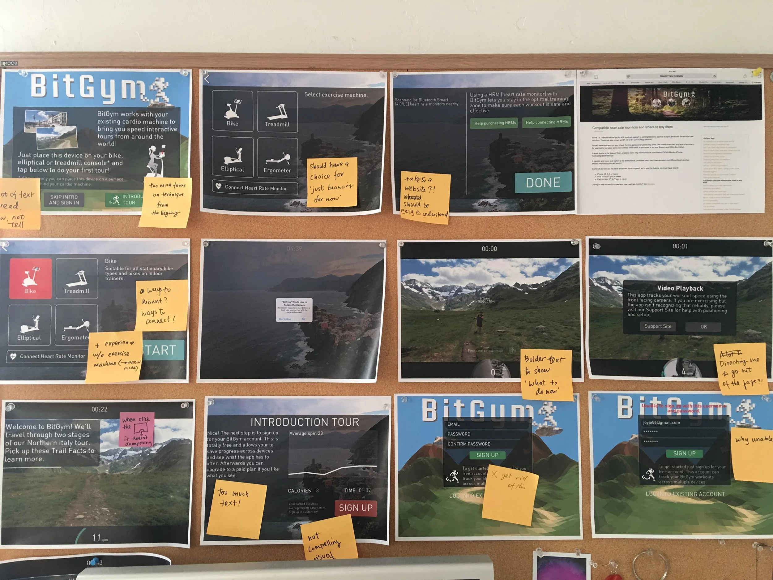
GATHER FEEDBACK
I recruited 5 prospect users and gathered a lot of good feedback. I filmed the interview process and summarized feedback for the team for revision.
